Your campaign looks perfect in the editor. You press “Send”. Then the replies start:
- “The email is a mess on my phone.”
- “I just see an empty box with a red X. What’s the offer?”
- “The button opens your home page, not the sale.”
- “How do I unsubscribe? I can’t find the link.”
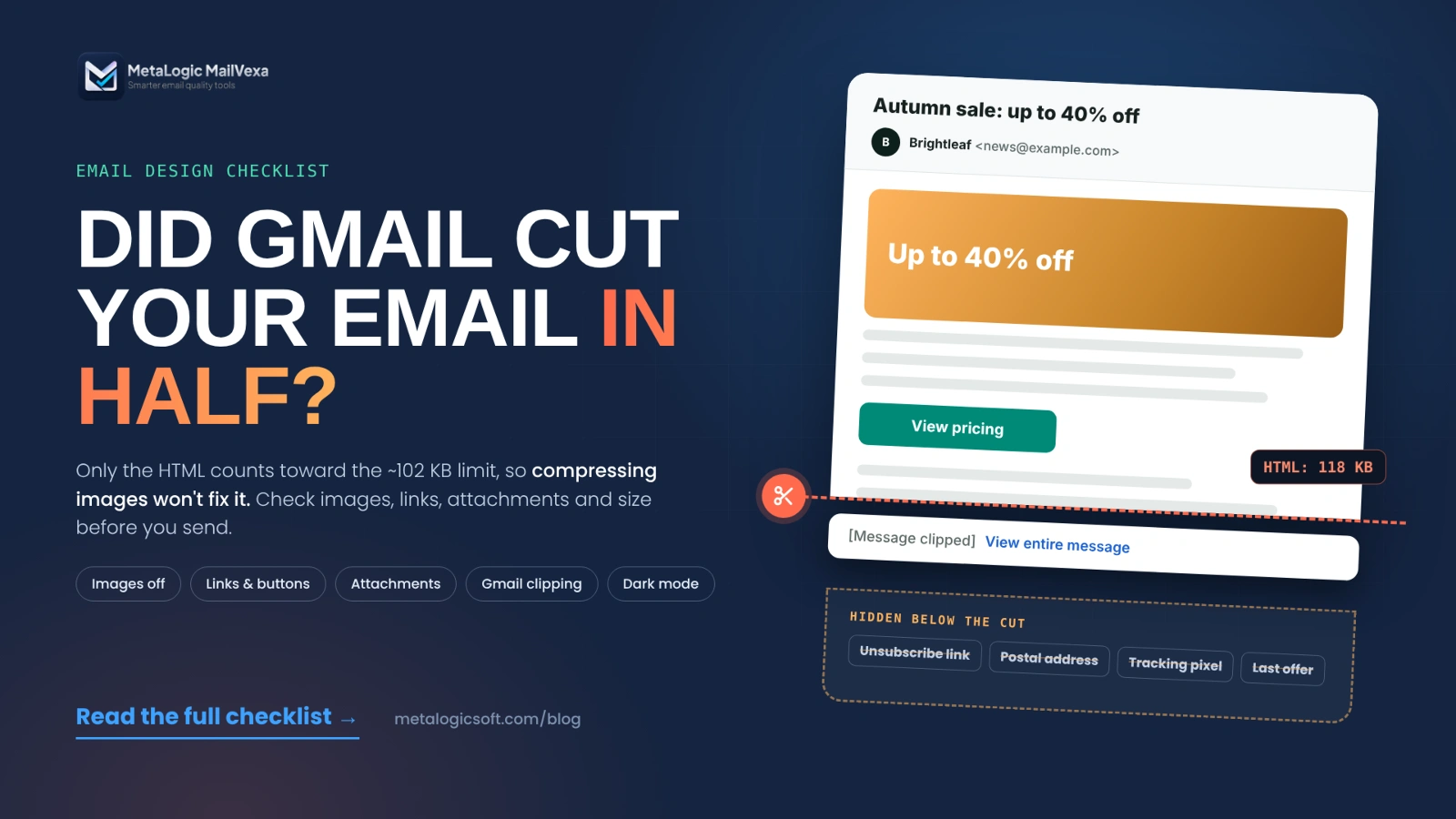
The last one is the sneakiest. Gmail cut the email in half, and the footer with the unsubscribe link was in the hidden half. Nothing looked wrong in your editor.
Good design helps people read your email, trust it and act on it. It can’t guarantee the inbox on its own. That also depends on your sender reputation and your list, which our guide to improving email deliverability covers. This email design checklist covers the part you control in the template: images, links, attachments and message size.
Quick answer
Before you send, check seven things:
- The main message and button still work with images turned off.
- Images are sized and compressed for how they’re shown, with useful alt text.
- Every link, including the logo and footer, goes to the right final page.
- Files are linked, not attached, unless the email really needs an attachment.
- The final HTML stays well under about 102 KB, so Gmail doesn’t clip it.
- You tested the real delivered email on a phone, in dark mode, and in Gmail, Outlook and Apple Mail.
- The sender and the unsubscribe link are easy to see.
The full checklist table is in section 11.
Start with a clear, mobile-friendly layout
Most layout problems come from trying to do too much in one email. Start with structure, then style.
- One main goal. Decide the one action you want, before you design anything.
- A simple order: main message, short explanation, button, then extra details.
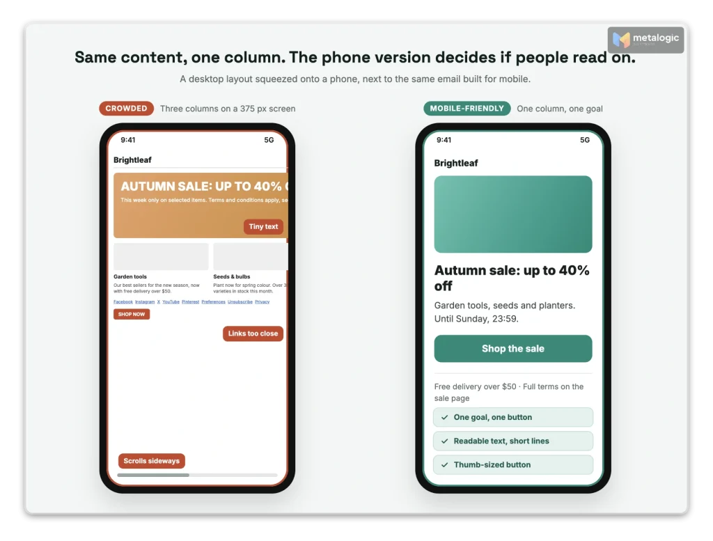
- One column for most campaigns. Multi-column layouts squeeze text into narrow strips on a phone.
- No horizontal scrolling. If a reader has to swipe sideways, the layout is too wide.
- Short paragraphs, clear headings and white space. People scan email; they don’t study it.
- Buttons big enough for a thumb. WCAG 2.2 sets a minimum target size of “at least 24 by 24 CSS pixels”, and its stricter level uses 44 by 44. For a main button, aim for the larger size, with space between links.
- Use an email-safe template. A page that looks right in a web browser can still break in an email app. Classic Outlook for Windows, for example, renders email with Microsoft Word’s engine, not a browser engine.
Images: keep the message useful when images are missing
Avoid image-only emails
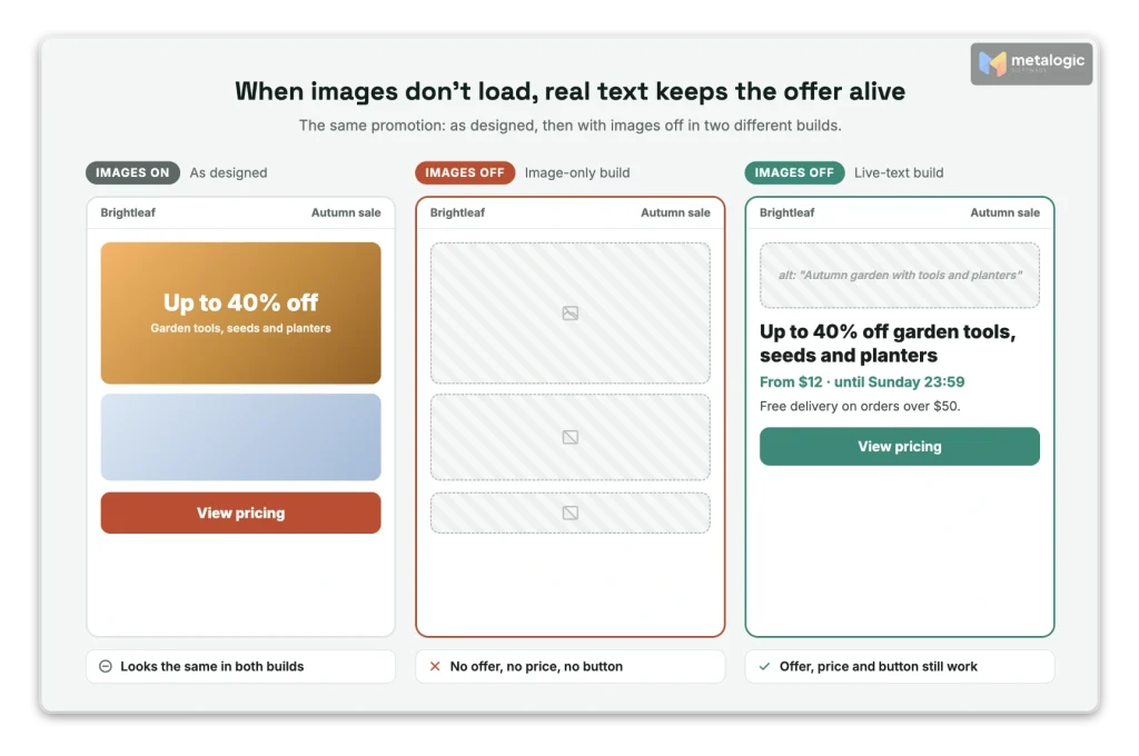
An image-only email is one big picture with the headline, price and button inside it. If the image doesn’t load, the reader sees nothing. Screen readers can’t read it either.
- Keep the headline, price, offer details and button as real HTML text.
- Use images to support the message, not to carry it. As Mailchimp puts it: “Save images for supporting your message, not delivering it.”
- Assume some people won’t see images. Some apps and company settings don’t load them automatically.
There is no magic text-to-image ratio
You’ll often read “use 60% text and 40% images.” Gmail’s sender guidelines don’t contain any ratio, and we found no mailbox provider that publishes one. The real rule is simpler: the email must make sense, and work, without the images.
Choose the right image format
| Format | Best for | Watch out for |
|---|---|---|
| JPEG | Photos | Text and logos can look blurry when compressed hard |
| PNG | Logos, icons, screenshots, transparency | Large files for photos |
| GIF | Short, simple animation | Heavy files. Classic Outlook for Windows shows only the first frame, so put the message there |
| SVG | Sharp icons on the web | caniemail reports Gmail now rasterizes linked SVG to PNG. Use PNG for logos |
| WebP | Smaller photos | caniemail notes Gmail “converts file to jpg” and doesn’t support WebP animation. Test before using |
Video? Don’t try to play it inside the email. Use a still image with a play icon, linked to a page where the video plays. It works everywhere and keeps the email light.
Resize and compress
Three different numbers describe an image. People mix them up all the time:
| Number | Example | What it affects |
|---|---|---|
| Pixel dimensions | 3000 × 2000 px | How much detail the file contains |
| Display size | 600 px wide in the email | How big it looks on screen |
| File size | 1.4 MB | How long it takes to download |
- Shrinking with CSS doesn’t shrink the download. A 3000-pixel photo shown at 600 pixels still downloads all 3000 pixels.
- Export at about twice the display width (for example 1200 px for a 600 px slot), so it stays sharp on high-resolution screens. Not more.
- Compress, then check. Logos, prices and small text must still be readable.
- Set your own budget. There’s no universal limit. Mailchimp’s upload guidance is “approximately 1MB or less” per image. For a typical campaign, much smaller is easy and loads faster on mobile data.
Write useful alt text
- Informative image: describe what it shows and why it matters.
alt="MailVexa results screen with four result groups" - Linked image: describe where the link goes.
alt="Download MailVexa for Windows or macOS" - Decorative image: use empty alt text,
alt="", so screen readers skip it. - No keyword stuffing. Alt text is for people, not search engines.
Hosting and dark mode
- Host images on a public, stable HTTPS address. Never on a page that needs a login, and never on a link that will expire.
- Prefer hosted images to embedded ones. Base64 images (data inside the HTML) are “not supported in Gmail”, according to caniemail, and they make the HTML much heavier. Embedded (CID) attachments add weight to the message too.
- Test logos on light and dark backgrounds. A black logo on a transparent PNG can disappear in dark mode. Add a subtle light outline or use a version made for dark backgrounds.
- Check text and buttons in dark mode. Some apps change your colors. Make sure the button text stays readable.
Links and buttons: make every click clear and reliable
Gmail’s sender guidelines say: “Web links in the message body should be visible and easy to understand. Recipients should know what to expect when they click a link.”
- Say where the link goes. “View pricing”, not “Click here”.
- Make the main button obvious, and build it in HTML, not as an image, so it works with images off.
- Match the button to the result. “Download the trial” must start a download or open the download page.
- Avoid public link shorteners. Google’s bulk mail guidelines recommend “that you do not use URL shortener services in bulk email” because they “can mask the real URLs”.
- Never put personal data in links. Don’t add an email address or name to a URL. Google Analytics’ policy says “Both the URL path and parameters must be free of PII.”
- Check tracking parameters. Adding UTM tags to a URL that already has a
?or a#can break it if done wrong. - Use as many links as the message needs. There’s no published link limit. But each link adds code to the HTML, which matters for clipping (section 6).
| Link | What to check |
|---|---|
| Main button | Correct destination, and the page matches the button text |
| Image and logo links | A relevant page, not a broken or old URL |
| Tracking links | The redirect works, and UTM tags survive to the final page |
| Download links | The file or download page opens without a login (unless that’s intended) |
| Social icons | Your real profiles, not the template’s placeholders |
| Unsubscribe link | Visible, and it actually unsubscribes |
Click the delivered email, not the editor
Most email platforms rewrite your links for click tracking. Test the links in the email you received, so you test the final redirect too. Also check the landing page: HTTPS, works on mobile, and says what the email promised. For writing the button text itself, see how to write marketing emails your subscribers trust.
Attachments: when to use a download link instead
For most marketing emails, the answer is simple: link to the file, don’t attach it.
| Situation | Better choice | Why |
|---|---|---|
| Newsletter with a brochure or guide | Link to a page or file | Lighter email, and you can update the file later |
| Software announcement | Link to the official download page | Gmail blocks installer files such as .exe, .msi and .dmg |
| Invoice or receipt for one customer | Attachment can be fine | It’s a transactional email the person expects |
| Confidential document | A secure, login-protected link | A public link can be forwarded to anyone |
- Many platforms don’t allow attachments in campaigns. Mailchimp offers file hosting instead “because attachments can slow or stop bulk email delivery, or cause security software to block your email.”
- Gmail blocks some file types completely. Its blocked list includes .exe, .js, .msi, .bat and .dmg, even inside archives like .zip. It also blocks “Password-protected archives with archived content” and “Documents with malicious macros.”
- Attachments grow on the way. Email encodes files as Base64. RFC 2045 says encoded data is “about 33 percent larger”. A 6 MB PDF travels as roughly 8 MB.
- Size limits are real. For personal Gmail accounts, the limit is 25 MB. Company servers often set their own, lower limits.
- “It’s only a PDF” is not a safety pass. Security tools scan PDFs too, and attackers use them. A PDF doesn’t guarantee safety or delivery.
- Label the link. “Download the setup guide (PDF, 2 MB)” tells people what to expect.
Keep invoices and receipts in their own stream, apart from campaigns. See why you should separate marketing and transactional emails.
Message size: what really makes an email heavy
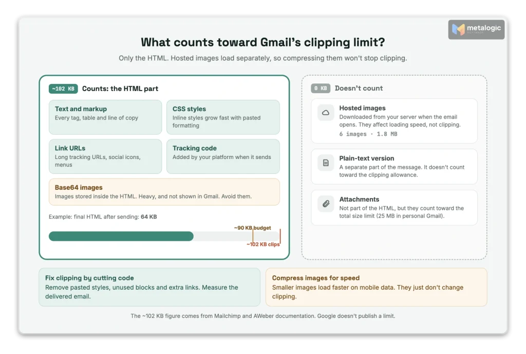
“My email is too big” can mean three different things. Each one has a different fix.
| Size type | What it includes | Main concern |
|---|---|---|
| HTML size | Text, code, styles, link URLs, tracking code | Gmail clipping, messy code |
| Hosted image weight | Images downloaded from your server when the email opens | Loading speed and mobile data |
| Total message size | HTML, plain-text part and attachments, after encoding | Sending and receiving limits |
Compressing hosted images won’t fix Gmail clipping
This is the most common mistake, even in popular guides. AWeber’s help article explains that clipping is measured on “the email’s HTML MIME type code.” Images loaded from a server “do not affect the size of the email for clipping purposes,” and the plain-text part “does not count towards the clipping allowance.” Compress images for speed. Fix clipping by cutting code.
How to stop Gmail from clipping your email
When an email is too large, Gmail shows the first part, then “[Message clipped] View entire message.” The reader has to click to see the rest. Most don’t.
Google doesn’t publish the limit. Email platforms do. Mailchimp says “Gmail clips emails that have a message size larger than 102KB.” AWeber says the same and warns its users at about 95 KB.
Why clipping matters
- It’s not spam, and it’s not a rejection. The email was delivered. It’s just cut.
- The footer is at the bottom, so your unsubscribe link and postal address can disappear.
- Open tracking breaks. AWeber notes that “the tracking elements at the end of the message can be hidden,” so Gmail opens may look lower than they are.
How to fix it
- Measure the final email, not your template. Your platform adds tracking links and code when it sends. Send a test to Gmail, open it, choose Show original, and check the size of the HTML part.
- Remove pasted formatting. Text copied from Word, Google Docs or a website brings hidden styles. Paste as plain text, or use your editor’s “clear styles” option.
- Delete unused blocks and repeated code from old templates.
- Cut extra links. AWeber says “A half dozen social media icons in the footer of a message can easily add 3–5 KB of size alone.”
- Shorten long newsletters. Show a summary and link to the full article.
- Keep a safety margin. We suggest a working budget of about 90 KB of final HTML. It’s a buffer, not a guarantee.
- Don’t over-minify. Some code exists for Outlook and other apps. Removing it can break the layout.
Your test email may clip when the real one won’t
Gmail groups test emails with the same subject into one conversation. Mailchimp warns this thread “can become so large that Gmail clips the test email.” Change the subject a little for each retest.

Accessibility and the plain-text version
Accessible emails are easier for everyone: people using screen readers, people on small screens, people reading in bright sun. Mailchimp’s accessibility guide sums it up: “Use clear language, strong color contrast, meaningful alt text, properly sized buttons, and descriptive link text.”
- Logical reading order and real headings, so a screen reader reads the email in the right order.
- Enough contrast. WCAG asks for a contrast ratio of at least 4.5:1 for normal text. Light grey footer text often fails.
- Don’t rely on color alone. WCAG says color shouldn’t be “the only visual means” of conveying information. Underline links in body text.
- The meaning must survive without images or color. “Prices in green are on sale” doesn’t work for everyone.
Check the plain-text version
Many platforms create a plain-text version automatically. Open it once:
- Does it contain the same offer, links and unsubscribe link?
- Are the URLs readable, or a long mess of tracking code?
- Did anything important exist only in an image?
A plain-text version is useful, but it’s not a secret route to the inbox or the Primary tab. See email delivery vs. inbox placement.
Keep the footer clear and working
- Who you are: your brand or company name.
- Why they’re getting this, when it helps: “You signed up on our website.”
- A postal address. The FTC’s CAN-SPAM guide says: “Your message must include your valid physical postal address.”
- A visible unsubscribe link, plus a preferences link if you offer one.
- Readable text. Tiny, light-grey footers fail contrast and look like you’re hiding something.
- Check it’s not clipped in the final email (section 6).
A footer link doesn’t replace one-click unsubscribe
Gmail and Yahoo require bulk senders to support one-click unsubscribe in the email header, and to show a visible link in the body. You need both. Our guide to one-click unsubscribe explains the setup.
Test the actual email, not just the editor preview
The editor preview shows your template. Your subscribers see the processed, delivered email. Test that one:
- Send a real test from the same platform and the same template as the campaign.
- Open it in Gmail, Outlook and Apple Mail, or whichever apps your audience uses most. Test both classic and new Outlook for Windows if your readers are businesses.
- Check a phone and a desktop.
- Switch to dark mode on the phone and look again.
- Turn images off and read the email again.
- Click every link, including the logo, social icons and a test unsubscribe.
- Check personalization: names, fallback text, and contacts with empty fields.
- Test the longest version if your content changes per person, like product lists.
- Check size and clipping on the final delivered email.
- Test again after any big template change.
Common email design myths
| Myth | Reality | Do this instead |
|---|---|---|
| “Fewer images always means better delivery.” | No provider publishes an image limit. Reputation and reactions matter more. | Use images that help, and keep key content in text. |
| “You need a 60/40 text-to-image ratio.” | No mailbox provider publishes a ratio. | Make sure the email works with images off. |
| “HTML emails are spammier than plain text.” | Gmail asks for HTML that follows standards. It doesn’t discourage HTML. | Send clean, valid HTML with a matching plain-text part. |
| “More than X links means spam.” | There’s no published link limit. | Use the links the message needs. Watch the HTML size. |
| “Compressing images fixes clipping.” | Hosted images don’t count toward clipping. | Cut code, pasted styles and extra links. |
| “If the preview looks right, it’s right everywhere.” | Each email app renders differently, and your platform changes the HTML when it sends. | Test the delivered email in real apps. |
If your emails land in spam, the cause is rarely design alone. Start with why emails go to spam.
The final pre-send email design checklist
| Area | Final check | ✓ |
|---|---|---|
| Layout | One goal, clear order, one column on mobile, no horizontal scrolling | ☐ |
| Text | Headline, offer and button work with images off | ☐ |
| Images | Right format, about 2× display width, compressed, useful alt text | ☐ |
| Dark mode | Logo, text and buttons stay visible | ☐ |
| Links | Every destination and redirect works, no shorteners, no personal data in URLs | ☐ |
| Button | Clear action, HTML button, large enough to tap | ☐ |
| Attachments | Replaced with links, unless truly needed and allowed | ☐ |
| HTML size | Final delivered HTML checked, safely under ~102 KB | ☐ |
| Accessibility | Contrast, descriptive links, meaning not tied to color | ☐ |
| Footer | Sender, postal address and unsubscribe visible and working | ☐ |
| Personalization | Correct values and safe fallback text | ☐ |
| Testing | Delivered email checked in your audience’s main apps | ☐ |
| List | Addresses checked before the send (next section) | ☐ |
Good design still needs a healthy email list
A perfect template can’t deliver to an address that doesn’t exist. If your list is full of old, mistyped or fake addresses, your beautiful email bounces before anyone sees it. And high bounce rates hurt the reputation that gets your next email delivered.
So campaign preparation has two checks that work together: the design check (this article) and the list check. The list check is email list validation, and MetaLogic MailVexa is email verification software built for it.
- Runs on your own Windows or Mac computer. Your list isn’t uploaded to an online service.
- Checks each address in layers: format, disposable and free-provider domains, MX records, SMTP and mailbox, catch-all, and the domain’s SPF and DMARC.
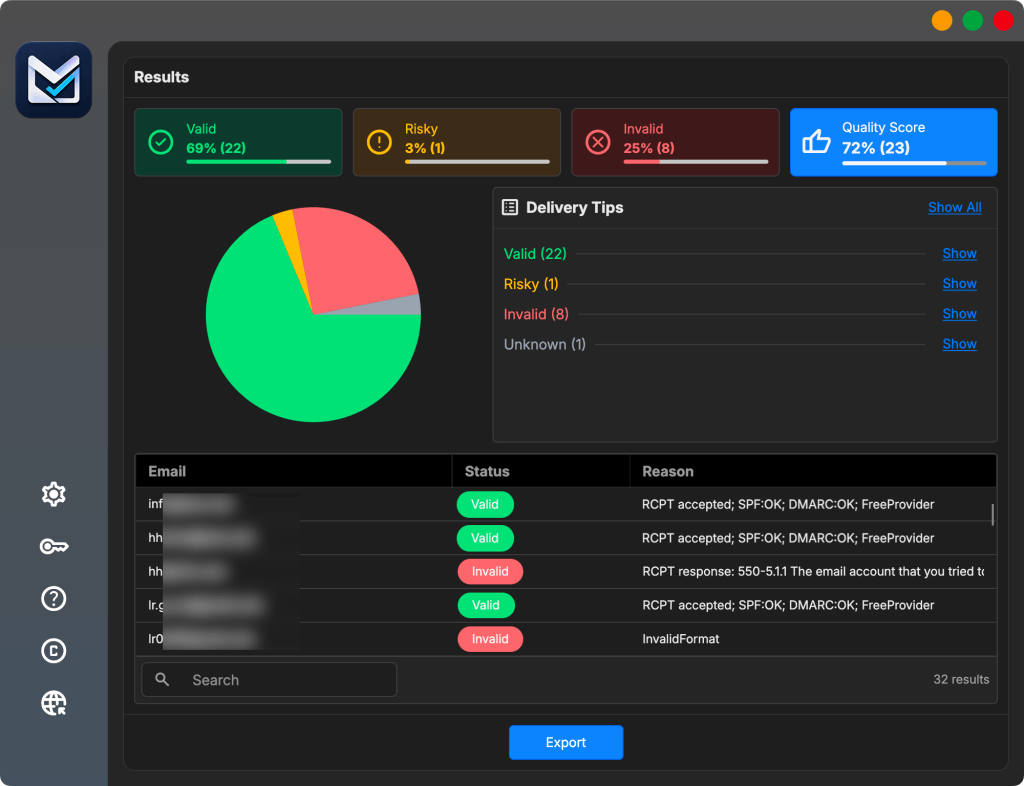
- Sorts every address into Valid, Risky, Invalid or Unknown, with a reason you can read.
- Exports clean files in CSV or XLSX, with the columns you choose, split into smaller files if your platform has an import limit.
- One-time license instead of paying per check, with a 14-day trial for up to 2,000 verifications.
MailVexa checks addresses, not designs
It doesn’t test HTML, links, rendering or clipping. Use the checklist above for that. And a valid address means a mailbox accepts mail. It doesn’t mean the person agreed to hear from you, or that your email will reach the inbox.
For the full process, read how to clean your email list before a campaign, then follow the step-by-step MailVexa tutorial. When you’re ready, download MailVexa and check your next list.
Frequently asked questions
What is the best image format for marketing emails?
JPEG for photos and PNG for logos, icons and screenshots work almost everywhere. Use GIF only for short, simple animations. Test SVG and WebP before using them, because support is partial in some apps.
How many images and links should an email contain?
As many as the message needs. No mailbox provider publishes a limit. What matters is that the email works with images off, and that extra links and code don’t push the HTML toward Gmail’s clipping limit.
Why does Gmail clip my email?
Because the HTML is too large. Email platforms report the limit as about 102 KB. Pasted formatting, old template code, long content and many links are the usual causes. Check the final delivered email, not the template.
Does compressing images prevent Gmail clipping?
Not if the images are hosted on a server. They aren’t part of the HTML, so they don’t count. It only helps if your images are embedded in the HTML as Base64, which you should avoid anyway.
Should I attach a PDF or link to it?
For marketing emails, link to it. Links keep the email light, avoid attachment blocks and let you update the file later. An attachment can be fine for an invoice or receipt sent to one person.
Can I use GIFs or videos in an email?
GIFs, yes, if they’re light and the first frame carries the message, because classic Outlook shows only that frame. For video, use a linked thumbnail with a play icon that opens a video page.
Is plain text better than HTML for deliverability?
Not by itself. Clean, standard HTML is fine. Plain text can feel personal and is a useful fallback, but neither format guarantees the inbox. Reputation, list quality and reactions matter far more.
How can I test my email in dark mode?
Turn on dark mode on your phone and computer, then open the delivered test email in each main app. Check the logo, text, buttons and any images with transparent backgrounds. Email testing tools can also show several apps at once.
Sources
Mailbox providers and Google
- Gmail: Email sender guidelines. Visible links, hidden content, HTML standards.
- Gmail: File types blocked in Gmail. Blocked extensions, archives and macros.
- Gmail: Attachment size limits. 25 MB for personal accounts.
- Google Cloud: Bulk mail guidelines. URL shorteners.
- Google Analytics: Best practices to avoid sending PII. No personal data in URLs.
Email platforms and testing data
- AWeber: Why is my message clipped in Gmail? What counts toward clipping.
- Mailchimp: Gmail is clipping my email. The 102KB figure and test threads.
- Mailchimp: Share files with contacts. Why it doesn’t allow attachments.
- Mailchimp: Accessibility in email marketing.
- caniemail: SVG images, WebP images, Base64 images.
Standards and regulators
- W3C: Target Size (Minimum). 24 × 24 CSS pixels.
- W3C: Contrast (Minimum). 4.5:1 for normal text.
- W3C: Use of Color.
- RFC 2045, section 6.8. Base64 encoding overhead.
- FTC: CAN-SPAM Act compliance guide. Postal address requirement.
Product
- MetaLogic MailVexa. Desktop email verification software for Windows and macOS.
Your email is ready. Is your list?
Check your addresses before your next campaign. MailVexa sorts every address with a reason, keeps bad ones out, and exports a clean file, all on your own computer.
Windows and macOS. Pay once, use for life. Free 14-day trial with up to 2,000 verifications.
We make MetaLogic MailVexa, so take our description of it with that in mind. Email app support changes often; sources were checked in November 2026. The 102 KB clipping figure comes from email platform documentation, not from Google.